
Taxi service picture from WIX
Why This Topic
I am interested in this subject mainly because of my experience using Uber when I was working in Beijing, China. I had a wonderful experience when Uber just entered Chinese market around 2016 and there was a price war between Uber and local competitors, since there were coupons, discounts and numerous incentives. However, two year later, I had a difficult time calling an Uber drive after work at 10pm, waiting in lines with more than 130 people. Out of curiosity, I decided to map out where those vehicles go, based on what I have learnt with mapping geographic data using tools such as QGIS and Leaflet.
The research question in this project is what the pattern of NYC Taxi Trips look like, including features such as rush hours, busy areas as well as large fares. There are three steps or three tools involved in this research,
-
Using QGIS to do data analysis and static mapping
-
Using Excel to extract hourly data and visualize traffic volume
-
Using Kepler to do interactive data visualization
Data Analytics
Data Requested from Taxi & Limousine Commision

After comparing datasets from Uber movement, Taxi & Limousine Commision, NYC Opendata and Kaggle, I finally arrived at a dataset provided on Kepler.gl. In this dataset, both fare and coordinates variables are included which would make my analysis clear and precise. The following variables are involved in this research, including tpep_pickup_datetime, tpep_dropoff_datetime, pickup_longitude, pickup_latitude, Dropoff_longitude, Dropoff_latitude, fare_amount.
Busy Taxi in NYC

Function involved:
-
Counting points in polygon
-
Styling based on criteria: counts of pickups in gradient
-
Picking a svg car as marker
Busy pickup zones

Function involved:
-
Counting points in polygon
-
Styling based on criteria: golden dollar
-
Labelling based on criteria: top 8 most pick up places
Fat dollars

Function involved:
-
Counting points in polygon
-
Styling based on criteria: golden chicken drumstick
-
Labelling based on criteria: top 8 most drop-off places
More Pick Up Than Drop Off
Function involved:
-
Joining columns to calculate pickup-dropoff
-
Counting points i n polygon
-
Styling based on criteria: golden dollar (for real)
-
Labelling based on criteria: top 8 most pickup(for real) places
Less Pick Up Than Drop Off

Function involved:
-
Ranking pickup-dropoff in a reverse order
-
Counting points in polygon
-
Styling based on criteria: destination flag
-
Labelling based on criteria: top 8 most drop-off(for real) places
Hourly Rides in a Day

Function involved:
-
Extracting hour from date and time in Excel
-
Plotting a bar chart with counts of rides of each hour
-
Labelling number of rides especially for top pickups(for real) and least pickups(for real)
Data Visualization
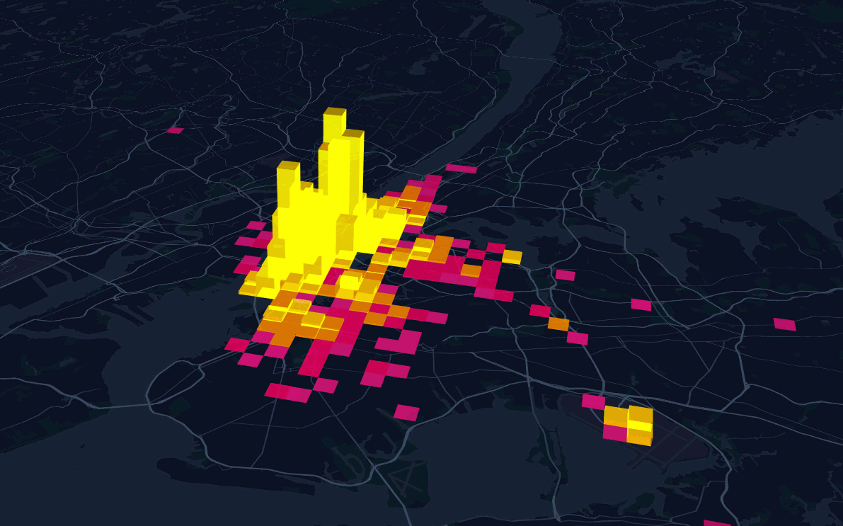
Dynamic Pickup Counts in a Day
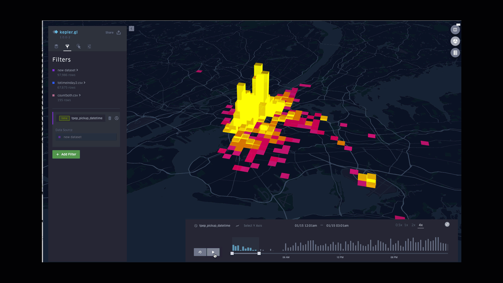
Function involved:
-
Plotting counts of pickups in column
-
Styling columns color based on counts, with the lightest for largest counts
-
Styling columns height based on counts, with the highest for largest counts
-
Applying pickup time to filters
Dynamic Drop-off fares in a Day
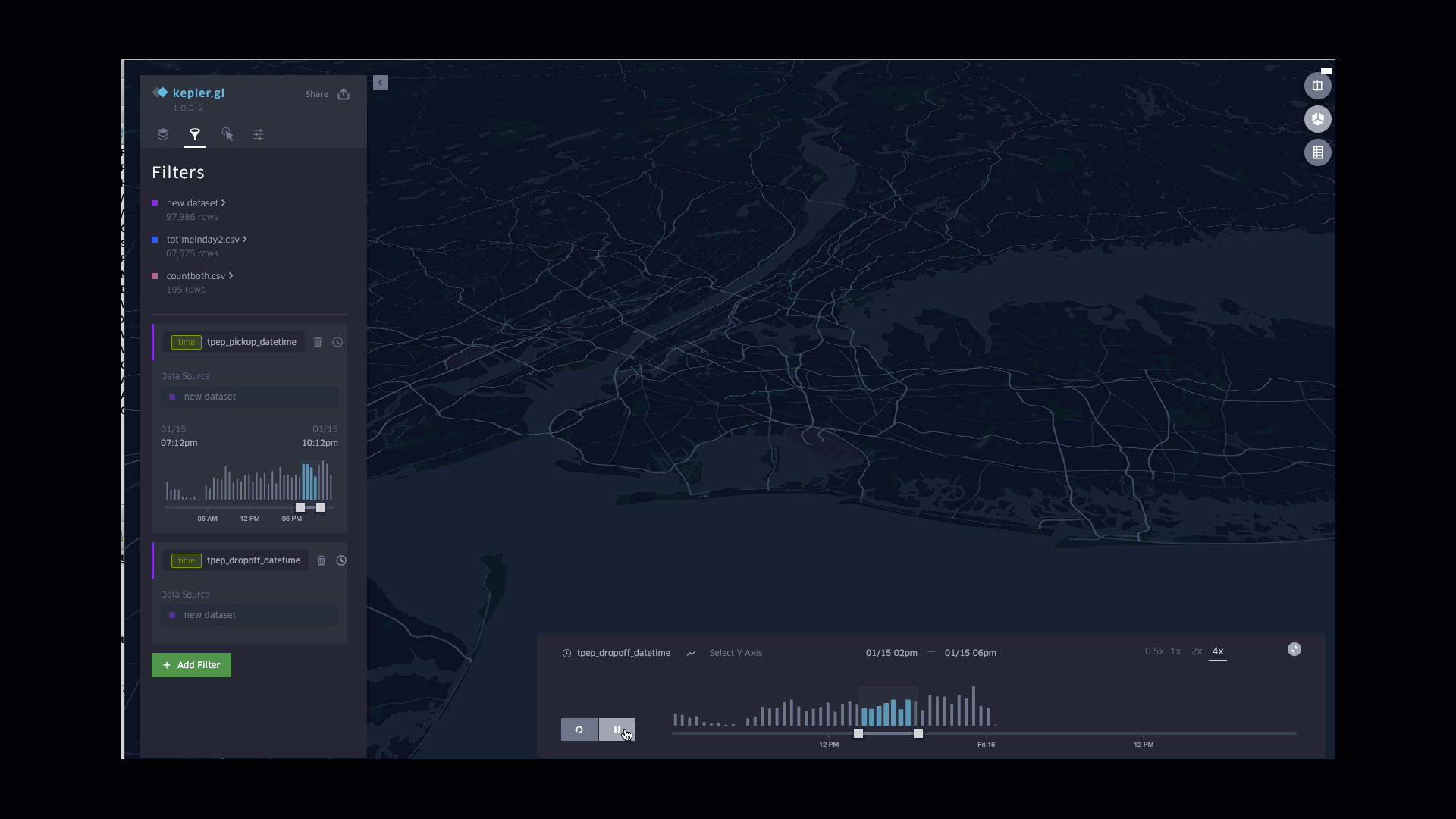
Function involved:
-
Plotting counts of pickups in column
-
Styling columns color based on counts, with the lightest for largest counts
-
Styling columns height based on counts, with the highest for largest counts
-
Applying pickup time to filters

Taxi on Roads picture from WIX
Key Takeaways
This analysis is more useful based on the perspective of taxi drivers, especially for new drivers. If the driver want to get business running fast, the driver should go to neighborhood with most pickups; If the driver want longer trips, fat dollar neighborhood is the friend; If the driver is more experienced, he or she would better go to places labeled with most pickup(for real); for drivers not in a very good mood at running empty taxis, he or she may not want to go to places of least pickups but still many drop-offs.
In terms of Kepler, it is more of a visualization tool than a geodata analysis tool as Qgis does. Kepler is competitive with more intuitive interface, interactive labelling, but lack of data analysis functions, especially joining datasets.
In this paper, trips of hours in a day are discussed, similar analysis can be done in weeks in a month, months in a year. In terms of pickups, drivers would be more interested. For passengers, drop-offs or available vehicles in the area could be more valuable. If uber movement data is available for New York City, it would also be interesting to see a greater count (if possible) than NYC taxi in 2019.